Thursday, 4 December 2014

Research #1 - A Brief History

What is stop motion?

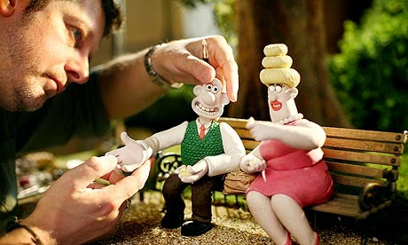
Stop motion describes the process of making a sequence of pictures play in order at a speed which creates the illusion of movement. This is generally achievable by taking many photos of an object, through moving it slightly between each photo, creating an animation. 

A well-known example of stop motion would be the famous 'Wallace and Gromit' animations. All the characters are made out of plasticine, and are therefore endlessly pose able. For every photo taken, parts of the characters are moved slightly. These individual photos are known as 'stop-frames'. 

After the shooting, these stop-frames are all played quickly to create the illusion of real movement, much like the different frames that make up an animated cartoon.


History.

Stop motion is an animation technique to make a physically manipulated object or persona appear to move on its own. It is among the earliest forms of filmmaking.

It has a long history in film. It was often used to show objects moving as if by magic. The first instance of the technique can be credited to Albert E. Smith and J. Stuart Blackton for Vitagraph's 'The Humpty Dumpty Circus' (1897) in which a toy circus of acrobats and animals comes to life. 


How quickly do the Stop-Frames change?

This partially comes down to personal preference. Ideally, a stop motion animation would hold 24 stop-frames within each second, though some may wish to attempt higher for smoother playback, or less with the price of more jagged animation. 

The best way to create fluid animation is to use a high frame-rate with very little movement between each frame. If done correctly, it can breathe life into the characters. 

Eadweard J. Muybridge.

Arguably one of the most important pioneers of 3D stop motion, Edward Muybridge was an English photographer of the 1800s; best known in the stop motion industry for his 'running horse' animation. 


His initial goal was to prove the theory that a horse is airborne at least briefly during a gallop, which he accomplished in 1877 after successfully photographing such a point in the horses motion. 

He proves his theory by taking several pictures of a horse running, placing them one after the other to create a moving image of a horse's gallop.

The Modern Stop Motion Industry

Whilst most animated films are not CGI, 3D stop motion is far from out the picture. Aardman Animations are still producing the children's television series 'Shaun the Sheep'.

Though Aardman Animations are well known in the stop motion industry, esteemed Director 'Tim Burton' has also created two animated 3D stop motion feature films. 'The Nightmare Before Christmas' and 'The Corpse Bride', the former of which is frequently looked back upon as a masterpiece in animation, and holds a cast cult following for its unique style and memorable characters.


3D Animation - NEW BRIEF!!!

Stop Motion Animation Production - 90 second challenge


Issued: 27/11/14
Due: 05/03/15


Working in groups of 3, produce a 90 second animated film in any stop motion technique.


Thursday, 27 November 2014

Tuesday, 25 November 2014

Our 2D Animated Commercial!


And so here it is! Our 2D Animated Commercial! Overall, both Amy and I are really happy with hoe everything turned out. Neither of us had used Dragon Frame before so everything was really new to us! Creating the characters certainly took some patience but I think they turned out really nice. The music flows really well with the advert which is really nice. 

When it came to editing we had to slow down and speed a few clips up, just to make it run nice and smoothly. 

I hope you enjoy :)


2D Animation

Saturday, 15 November 2014

Statement of Intent

ANIMATION STATEMENT OF INTENT...


For this brief, Amy and I set out to create a 30 second animated 2D commercial with original sound. We wanted to create a commercial for an online dating website, with two characters who meet online, decide to meet up and eventually fall in love. 


We intend to do this using stop-motion animation with dragon frame on the Mac. We will create the characters with card, the background with tissue paper and add hinges from blue tack so that all movements are smooth. For every movement we will take an individual picture and then upload it to a computer. This will then be put onto Final Cut Pro for us to edit. 


Thursday, 13 November 2014

Agreed Permission to Music

We heard back from someone Amy and I worked with over the Summer about a track we recorded and edited for him. He gave us his permission to use a 30 second clip of his song in our animation advert. 


If you would like a little listen, here is the song we will be using! 

George Sims - A Song For You

We are really happy with the music, it's the perfect pace for the couple to walk along to. It's also quite romantic, which fits with the theme of two people meeting for the very first time and falling in love. 

Logo


The logo for our animation came from a website called 'dafont.com'. This is a great website for creating fonts for productions, with a huge variety of themes and fonts to fit any production. 

The one we have chosen for our animation is called 'Jenna Sue Font' which is in the handwriting section. It's a lovely font, quite feminine and delicate. It's easy to read, but also looks professional. 


Finally, for our animation Amy suggested we put a heart on the dot for the eye, to work with the idea that this is an online dating website advert. So we went onto Word, found an image of a heat, made it red and moved it onto our logo. This looks really nice and we have used it for the placement at the end of our animation advert. 

Wednesday, 12 November 2014

Story Board

Here are the story boards for our 2D Animation Commercial...


Thursday, 16 October 2014

Presentation

Presented by Sophie Newton and Amy Davis.

This explains our idea, our style, our target audience and an introduction to our characters.

Our Presentation

Thursday, 9 October 2014

THE IDEA!


IDEA! 

     Two young people want to find love and sign up to a dating website. They meet one another and arrange to met up. They meet in a nearby park and conversation flows. They find themselves laughing and getting along really well. Montages begin of various times they meet up with each other, each time progressing more into a relationship. A soft female voice over talks over the animation with facts of the dating website and the number of relationships that now meet online. The advert ends with the logo;


Logo

Jenna Sue font from dafont.com

This is a simple design for our logo which will be used in animation for our 30 second advert. 


Target Audience


Research into Animation


Paperman

This is a 2012 black-and-white 3D hand-drawn/computer animated romantic comedy short film produced by Walt Disney Animation Studios and directed by John Kahrs.

It was released November 2nd 2012.

The short blends traditional animation and computer animation.

The short won both an Academy Award for Best Animated Short Film at the 85th Academy Awards and the Annie Award for Best Animated Short Subject at the both Annie Awards.

Paperman was the first animated short film produced by Walk Disney Animation Studios to win an Academy Award since It's Tough to Be a Bird in 1970.


John Kahrs speaks of the drawings - Disney


Drawings of male character
Drawings of female character

      This is a beautiful short animation about a guy who has various missed opportunities at getting the girl but refuses to give in. It has inspired both Amy and I for our animated commercial purely for the plot and the romantic storyline.


Permission to use Music

Message sent to Jack Johnson for use of 'Better Together' 

Message sent to Taylor Swift for use of the song 'Love Story'

Message sent to Adrian Delgado for use of his song 'All I Need Is Your Love'

Progression of Idea

Dating Website - following a love story 


Different online dating websites -


Different adverts for dating websites - 

All online dating websites use a brief advert either on the TV, or online to promote their website. They all seem to follow the story of a romance beginning in order to promote the fact that the couple found love on their website. A few examples of adverts are;

Uniform Dating

This advert already uses animation for its characters and backgrounds. It uses characters with and without uniform, displaying a fun and unique way of meeting people. 

This is a website open for both men and women aged 18+ who work in uniform (police, nurse, doctor) However those not in uniform can also join (defeating the object and the name a little bit...) The website allows people to meet and converse with one another despite working long days and various hours. 

eHarmony.co.uk

This adverts uses a lovely voice over with a simple montage of images of the couple meeting. The voice over simply states why the viewers should choose a dating in the website in the first place and that eHarmony understands and supports you through the journey.


Match.com

This dating website is also open to both men and women who are wanting to find love, or even just a friendship. You can talk to members all over the UK at any time. On the website you can filter your searches from age range to where they live.

The advert is two people at a train station as he begins to sing a song to her to gain her attention. He changes the lyrics to fit their feelings as he reads her facial expressions hinting at the answers.


Friday, 3 October 2014

Lesson

We looked at a few animations:

Why does my heart feel so bad? Official Music Video

Mr. Scruff Flash and After Effects

History of an Orange Emma Lazenby. Channel 4. Paper cut-out.


The Life Size Zoetrope is the celebratory life story of one man, told via a one-take live action shot of a human zoetrope containing the film. 

It is an animation created in Photoshop with combined life action video. 36 printed books of each animated loop, shot live action on a Round Up fairground ride. This was then edited and stabilised using Final Cut Pro. 


Mark Simon Hewis AnimateTV 2007


Animation Ideas

Hair spray product - "Mental Hair' Funny looking characters.

Sweets - Trail of sweets on the floor. Leading them to the packet.

Cake - Mini cakes, decorations, beauty. Irresistible.

Jewellery - 'A Proposal' Special occasion. 

Dating website - follows a love story. 


Thursday, 2 October 2014

Using Adobe Flash

Using Adobe Flash

This morning we went out in groups and filmed ourselves dancing, moving, running and jumping etc.

We then uploaded the videos onto the computer and changed their settings to Flash content.

We put our favourite clips in Adobe Flash to make a timeline. This generates every single movement into a seperate frame, allowing us to be more precise when working.

Using the paint tool, we drew around the outlines of Anna per frame and gradually built up the image we wanted. 

Once we were happy with our drawn image we would remove Layer 1 to see just our own drawing, press play and see the moving image. 

For drawing around the image we could either muse use the mouse or a drawing track pad which we could plug into the computer. 


Images from Adobe Flash of the footage we captured.


Working on Adobe Flash


Thursday, 25 September 2014

Studio Research

Questions) Choose 1 commercial from each studio and reflect on:

How is it made? (techniques, filmmaker)
Who is the client?
What is the message?
Does it (the tagline) work?


A BAFTA winning independent production company and animation studio creating ground-breaking visuals across an unlimited range of media. 

Set up in 1966, they have produced TV advertising campaigns, short films and documentaries, including the first full-length documentary made for British TV.

Chosen Clip - Channel 5 Creative Bursts 'Love Story'

This title is created using cut out paper as the characters, backgrounds and props are flat. They have quite literally been cut out of a magazine which is shown to open and close, with the animation trapped within.

The client is Channel 5 and the audience watching the channel just before a TV show begins. It works as a small advert promoting the channel itself.

The message is strong communication, no matter where they are and any struggles they might come across.

There is no tagline as such, just the title of the TV channel at the very beginning. Overall, it is a short yet effective clip used to advertise channel 5 just before a show begins.


A multiple Oscar winning independent production company established in 1987, with offices and animation studios in London, Paris, New York and Melbourne. 

They create every form of animation and live action imaginable across an unlimited range of media. 


This title is created using computer generated images and live action footage. 

The client is Compare the Market and the audience watching the channel, again just before a show. It can always be found during Coronation Street so the target audience is families, typically housewives with children who are looking for insurance.

The message is to persuade the audience to get their insurance on the Compare the Market website, by tempting people with collecting the meerkats. The adverts run in a series structure allowing the audience to follow the advert/story from beginning, to end. 

The tagline is to choose Compare the Market as your insurance comparative site over any others. 


Studio aka are a multi-BAFTA winning and Oscar nominated independent animation studio based in London. They're known internationally for their idiosyncratic and innovative work, expressed across an eclectic range of projects.


This title is created using computer generated images. The characters and the locations have both been created on a computer.

The client is Lloyds TSB who have asked for studio aka to create them a series of adverts to promote their bank. The audience watching the adverts are also the audience as they are the people Lloyds TSB and studio aka are trying to persuade to choose Lloyds over any other bank.

The message running through all the adverts is that a bank should be simple and easy to use with rewards for using them. It also states that the customers future is always in mind.

The tagline is 'for the journey' as each adverts follows a particular person on their own journey but always with Lloyds bank just behind them to help along the way.


The Nexus studio lies at the heart of productions. It provides the artistic and technical support to realise the vision of the directing talent and craft beautifully executed ideas.

Their in-house capabilities include: script writing, concept art, character design, pre-biz, 3D animation, stop frame, 2D animation, composting, CG events, motion graphics, software development and stereoscopic delivery.

Based in London's Shoreditch district, the 110-seat stud lies in the middle of London's creative and tech hub, giving it access to an amazing community of leading artists and innovative coders.

Chosen Clip - Talk Talk 'The Mission'

This title has been created through computer generated images and live action for the creation of the backgrounds and scenery.

The client is Talk Talk who are a home broadband company in need of adverts to persuade people to choose their network over any others.

The message is that without the extra cost, you can still get the qualities of any other broadband company.

The tagline "It's good to talk, but better to talk talk' works fairly well, but isn't shown so much in this particular video.


First Lesson

2D Animation - 6 weeks

What techniques are needed for a good animation?


  • Good storyline
  • Interesting characters
  • Animate acting shots, one phrase at a time
  • Facial animation, not just poses
What is the principle for animation?

  • Created frame by frame (stop-frame)
  • Squash and stretch (give a sense of weight and flexibility to drawn objects)
  • Anticipation (prepare the audience for an action)
  • Timing (number of drawings for a given action)
  • Exaggeration (alterations in the physical features of a character)

Paper Animation - 
South Park      

A-ha - Take On Me - Official Music Video 


Rotoscoping 
      Animation technique in which animators trace over footage, frame by frame, for use in live-action and animated films.

Cutout
     Animation technique for production animations using flat characters, props and backgrounds cut from materials such as paper, card or stiff fabric. 

Stop motion
     Animation technique to make a physically manipulated object appear to move on its own. 


A Scanner Darkly

1977 Sci-Fi novel by Philip K. Dick
2006 film by Richard Linklater

Robert Downey Jr.
Keanu Reeves